Cash-on-hand banking concept
Problem: What kind of banking experience do Millennials want?
Visa wanted to engage a client, a national bank, in a design-thinking innovation workshop. The client asked us to perform consumer research targeting Millennials and their banking needs. We shared our findings during a workshop and then proposed a new banking product that satisfied those needs based on our insights.
Solution: Provide an integrated banking experience that shows "cash on hand."
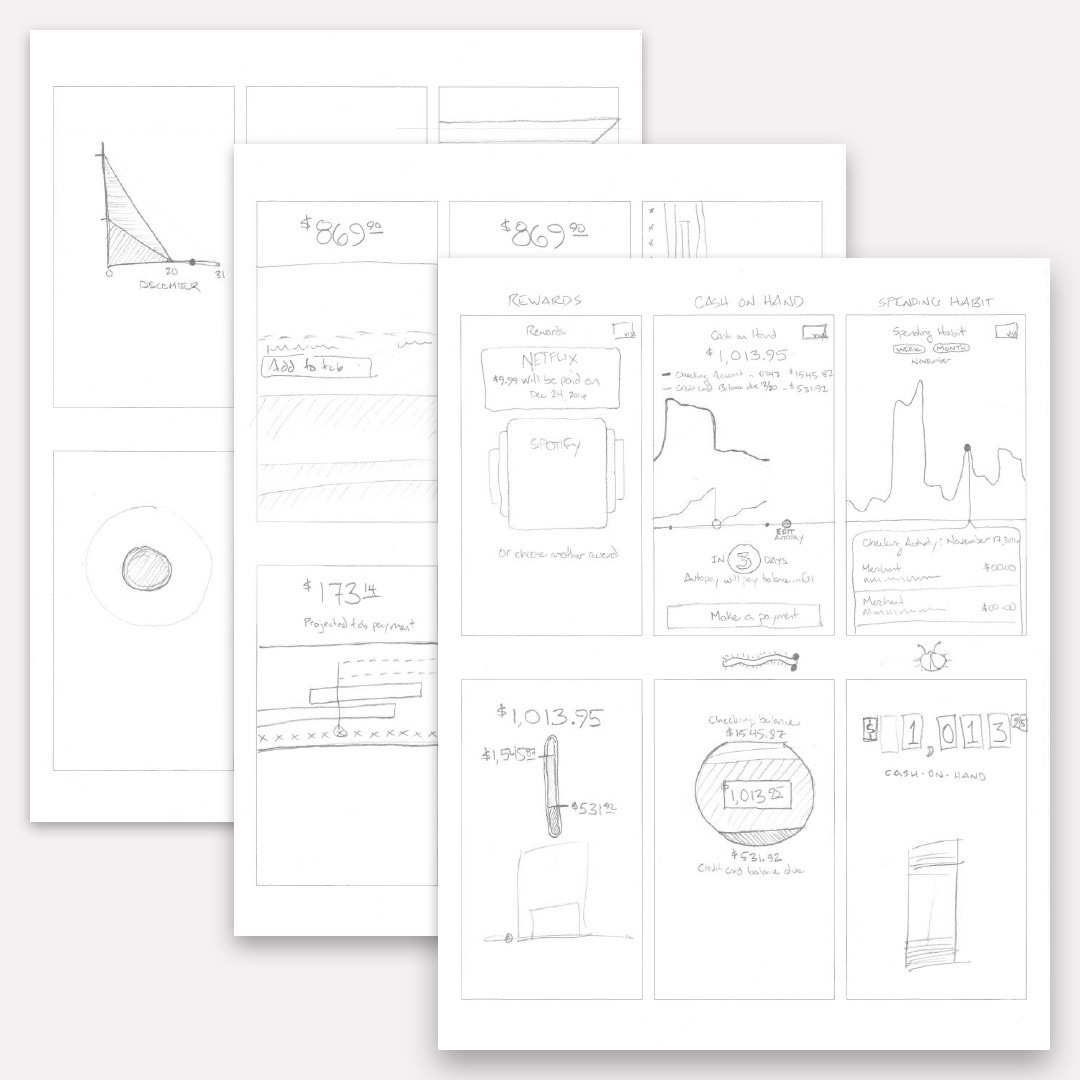
We interviewed 6 people, 3 men and 3 women, aged 21–38, and asked them open-ended questions about budgeting, banking, credit-card use, how they shop, and how they finance large purchases. We created empathy maps (picture below) for each participant and categorized their interview responses into 4 categories: what he or she thinks, feels, says, and does, following the Nielsen Norman Group template for empathy mapping. After reviewing as a group and analyzing comments, a common theme appeared among all participants: they bought what they could afford using a debit card and avoided credit cards as much as possible.
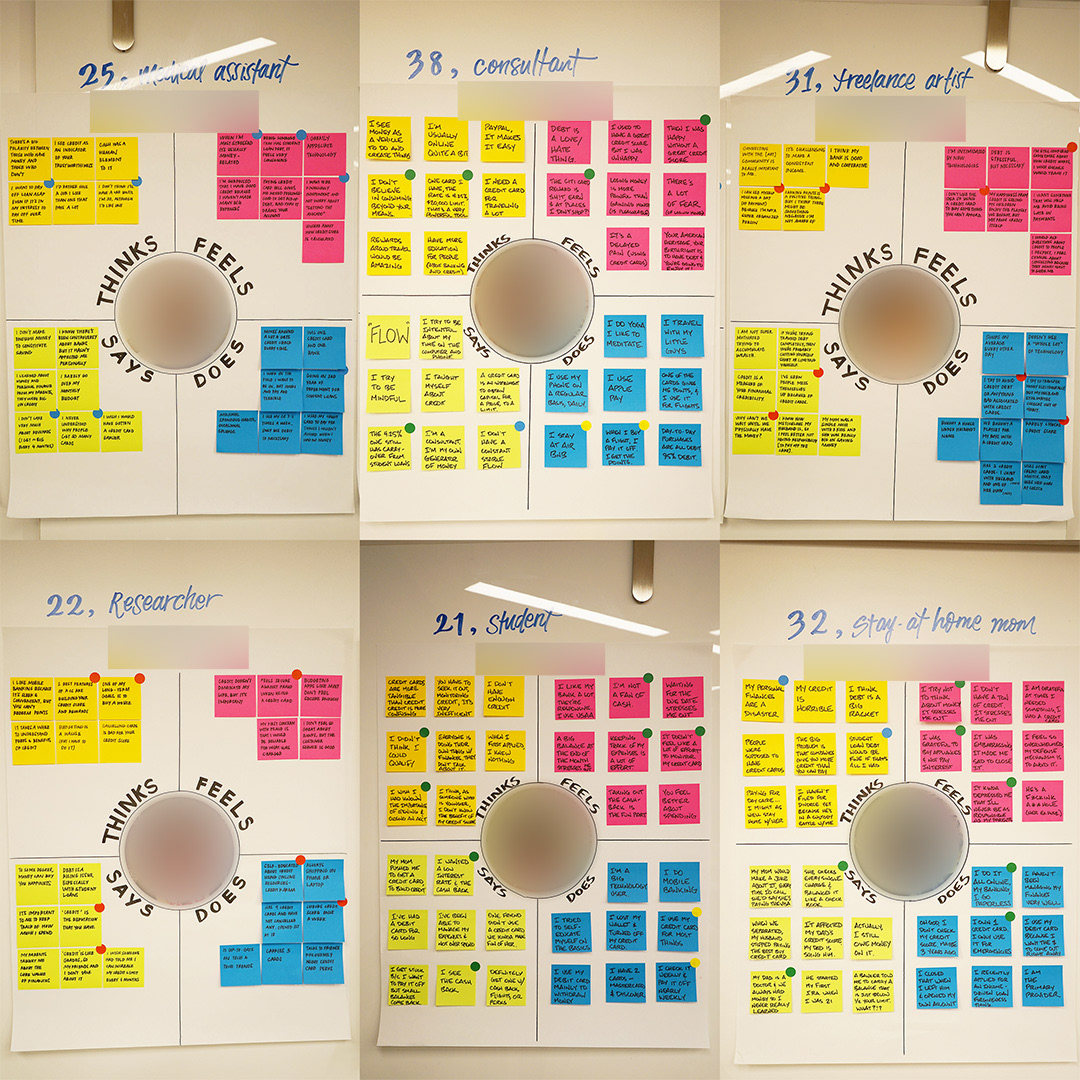
Empathy maps of each interview participant.
Concept tests
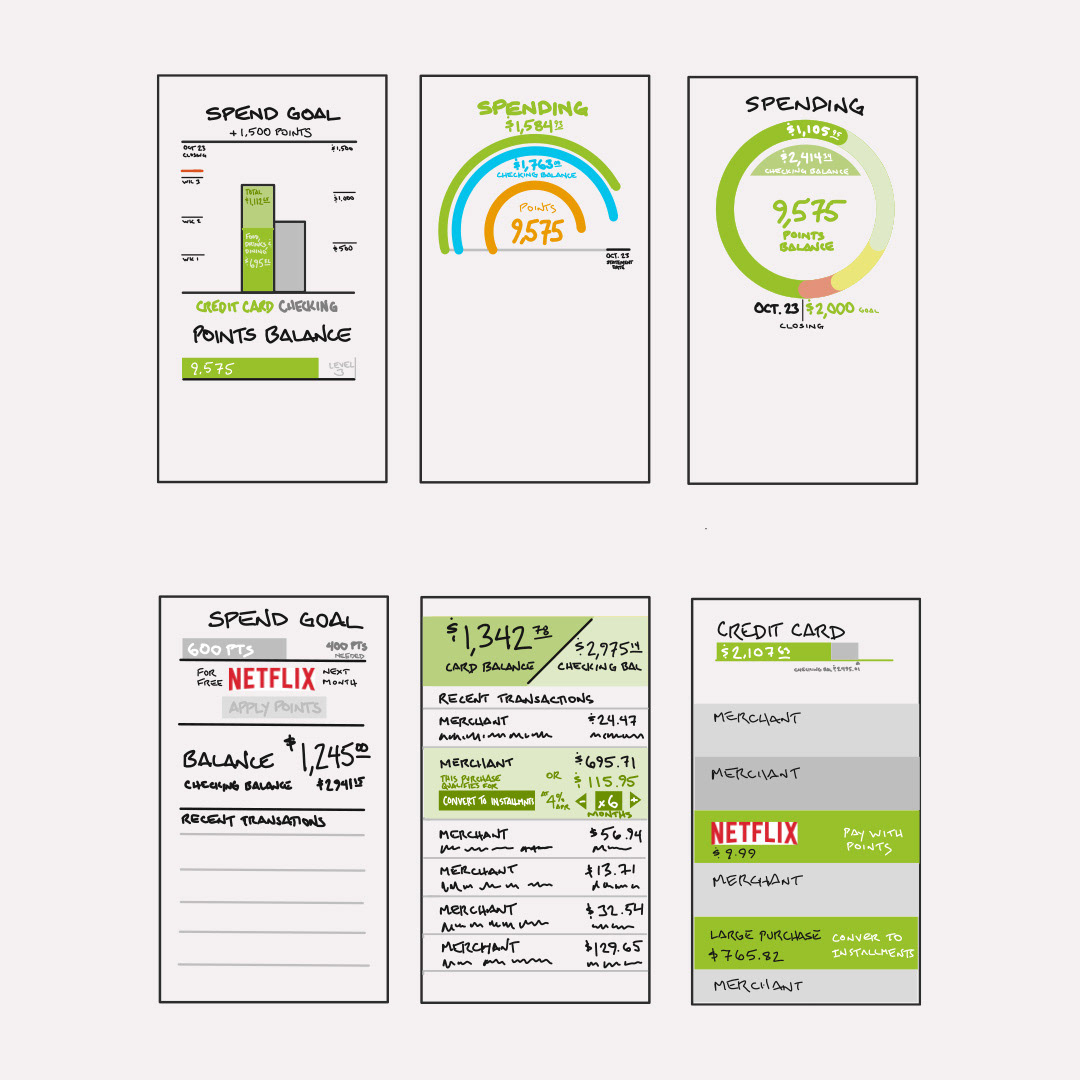
We discovered an insight into Millennial attitudes about spending and saving money. It wasn't that these people didn't want credit cards, it's that they wanted to remain debt-free. They all understood the utility of credit and some enjoyed the rewards that credit cards offered. We then created low-fidelity mockups (pictured below) to test with a second group of Millennials, representing financial concepts such as:
Cash-on-hand: the difference between money in a checking account and debt owed on a credit card.
Spending limits: a budgetary tool to minimize spending.
Spending notifications: a text or app notification alerting a user to a spending limit.
Automatic credit-card payment: an incentive for the user to automatically pay a credit card balance monthly or even weekly.
Spending habit reports: a summary of account usage in a chart format to aid in budgeting money.
Installment tab: a large transaction that qualified for low- or zero-APR financing if paid in installments over time.
Selectable rewards: a recurring transaction designated as an eligible reward for a monthly credit, such as a subscription to a music or video streaming service.
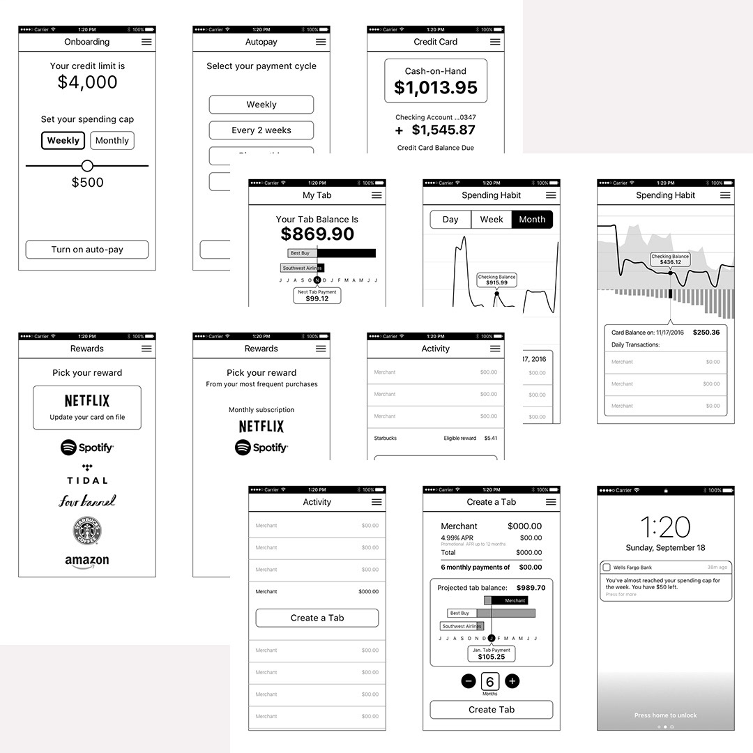
Low-fidelity mockups used for concept testing.
Result: Cash-on-hand won the concept tests
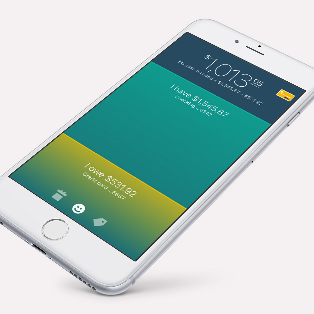
People favored the idea of seeing how much money they had to spend between a checking account and a credit card. We conceived this as positive cash-on-hand if the user had more money in the checking account than what they owed in credit. The user interface design pictured at the top of this page illustrates this.
Conversely, a user had zero cash on hand if they owed more on their credit card than what they had in their checking. We emphasized plain language to clearly communicate these differences, stating balances in complete sentences such as "I have $100" and "I owe $200". In such as case, we added language that instructed a user to "Deposit $100" by their credit card payment date (pictured below).
The user interface designs pictured below also illustrate 2 companion concepts: installment loans and selectable rewards. A portion of the user's credit limit could be reserved for installment loans—called tabs—for larger purchases. For selectable rewards, a user could choose a meaningful reward to receive if they spent enough money using their credit card. This would be applied toward a recurring transaction, such as a charge for a video streaming subscription.
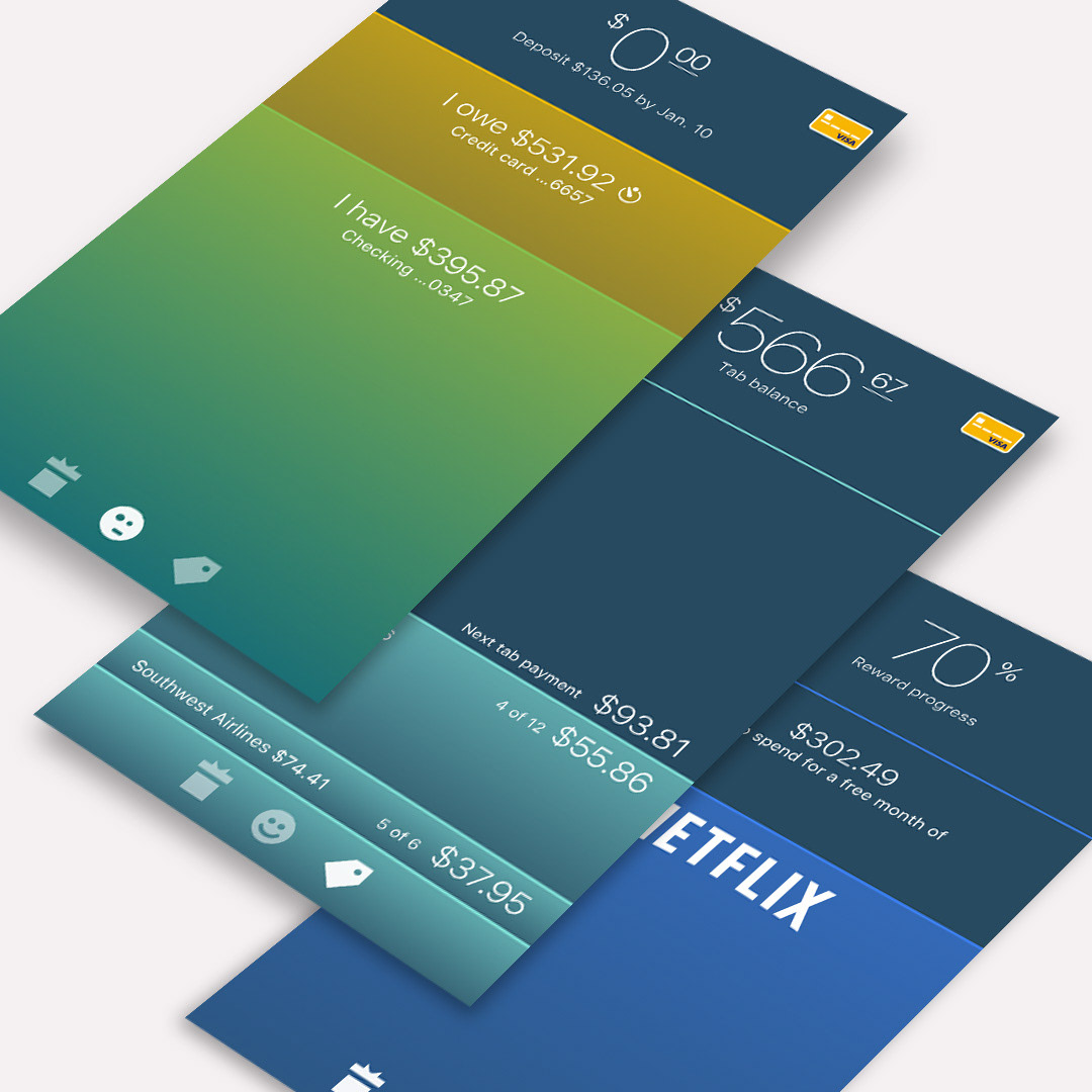
From top: zero cash on hand, current tab balance, and progress toward a monthly reward.
Product differentiation
Though we discovered these insights through primary research, the reader may not be surprised by what we have learned. Millennials are particularly conscious about credit-card debt as many have suffered family financial consequences of the Great Recession. Whereas older generations performed monthly financial accounting using bank statements, the Millennial generation was raised with online banking. Most banks offer mobile apps that allow users to monitor transactions in real-time. Many banks and budgeting apps already offer variations to the concepts we tested. We wanted to provide a product differentiation with a unique interaction design.
Since cash is often referred to as "liquid" we applied a liquid concept to the user interface, animating balance lines as if they were filled with water. We borrowed this concept from the iOS Compass app, which included a digital level (it has since been moved into the new iOS Measure app). We wondered: what if a balance line adjusted up and down like a level? This movement would be animated as a response to the differences between accounts, in addition to how a user held their mobile phone. Tilting the phone would force the "liquid" balance to remain level. This animation would provide a hint to a secondary feature: a historical transaction record as a graph when viewed horizontally (pictured below).
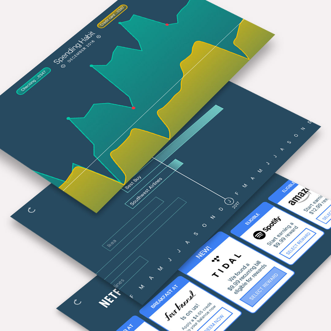
From top: historical transactions in a graph, tab repayment progress over time, and selectable rewards.
User testing
We provided a partially interactive and clickable prototype to test with a third group of Millennials via remote user testing. Responses ranged from mild curiosity to great excitement. At a minimum, all users understood the basic concept and the interaction design (animated prototype and user testing comments provided below).
Reception
The client was delighted by the process of discovery and the innovative concepts. It helped them form a strategy for a new product launch, loosely based on these findings. Though this particular solution was not implemented, it served as a catalyst for product development within their own organization.
Preliminary sketches and user interface concepts are illustrated below.