Problem: User engagement was too low.
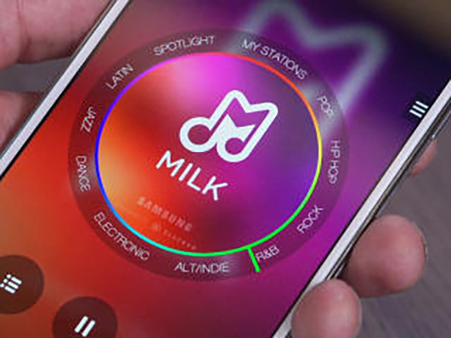
Samsung launched a free music service to compete against Pandora, as a music app exclusively for users of Samsung mobile phones. The service followed a delivery model similar to Pandora's: listeners selected a station and heard songs of a similar genre, with advertisements. They could refine a station to hear more songs by a certain artist but they couldn't select a song to play on demand.
Product leadership noticed large bursts of new users from marketing campaigns followed by low retention rates. They asked us to investigate what might be wrong.
Evaluative research: Guerrilla-style user testing
The team conducted 3 sessions of user testing by intercepting people at a local coffee shop, a shopping mall, and a university. We targeted new users and asked them to try the service in exchange for a gift card. We then observed their first-time use and asked follow-up questions.
Results: The app looked cool but was confusing.
1. Because stations were ordered by genre around a dial, when a user changed a station, they thought they were simply changing a song. The interface didn't emphasize that stations were a curated group of songs.
2. There were 2 ways to skip a song: press the skip button, or change the station. Users didn't understand the advantages or disadvantages of either method.
3. The format of the dial for a user interface was innovative but difficult to use. The movement required to change a station within a genre was too small. Instead of dragging the needle on the dial, users often tapped around the dial. As a result, they often selected a song of a style that was too different from their taste.
4. Although the dial had a second scrolling area inside that allowed fine-tuning (covering the album artwork), the necessity of such a feature was confusing. Furthermore, it was undiscoverable because there was no affordance provided for it.
Animated tutorial
Solution: Provide a tutorial for first-time users.
We proposed a short tutorial for first-time users. The tutorial used language to emphasize "stations" as opposed to "songs" and illustrated the act of rotating the dial as opposed to tapping. It also illustrated the elusive inner dial. I provided the design and implementation of this animated tutorial.
Results: About 60% of users skipped this tutorial.
Because there was a technical delay required to download music content for first-time users, we timed the length of the tutorial to match this delay—about 10 seconds. Ironically, despite needing to wait for music to download, most users were impatient enough to skip watching a 10-second animated tutorial. Our effort did not affect retention rates.
Lessons learned
Users generally responded well to the visual design of the interface even though using it was confusing. The purpose of the current interface design was to provide a playful interaction that facilitated music discovery. More research was needed into user goals, validating music discovery as one of them.
The service design followed a model of music delivered via radio stations. However, this mental model was not very prevalent among younger users who were used to streaming music on-demand. Unfortunately, offering music on-demand was not within the financial scope of business. The concept of radio stations and their presentation required further investigation.