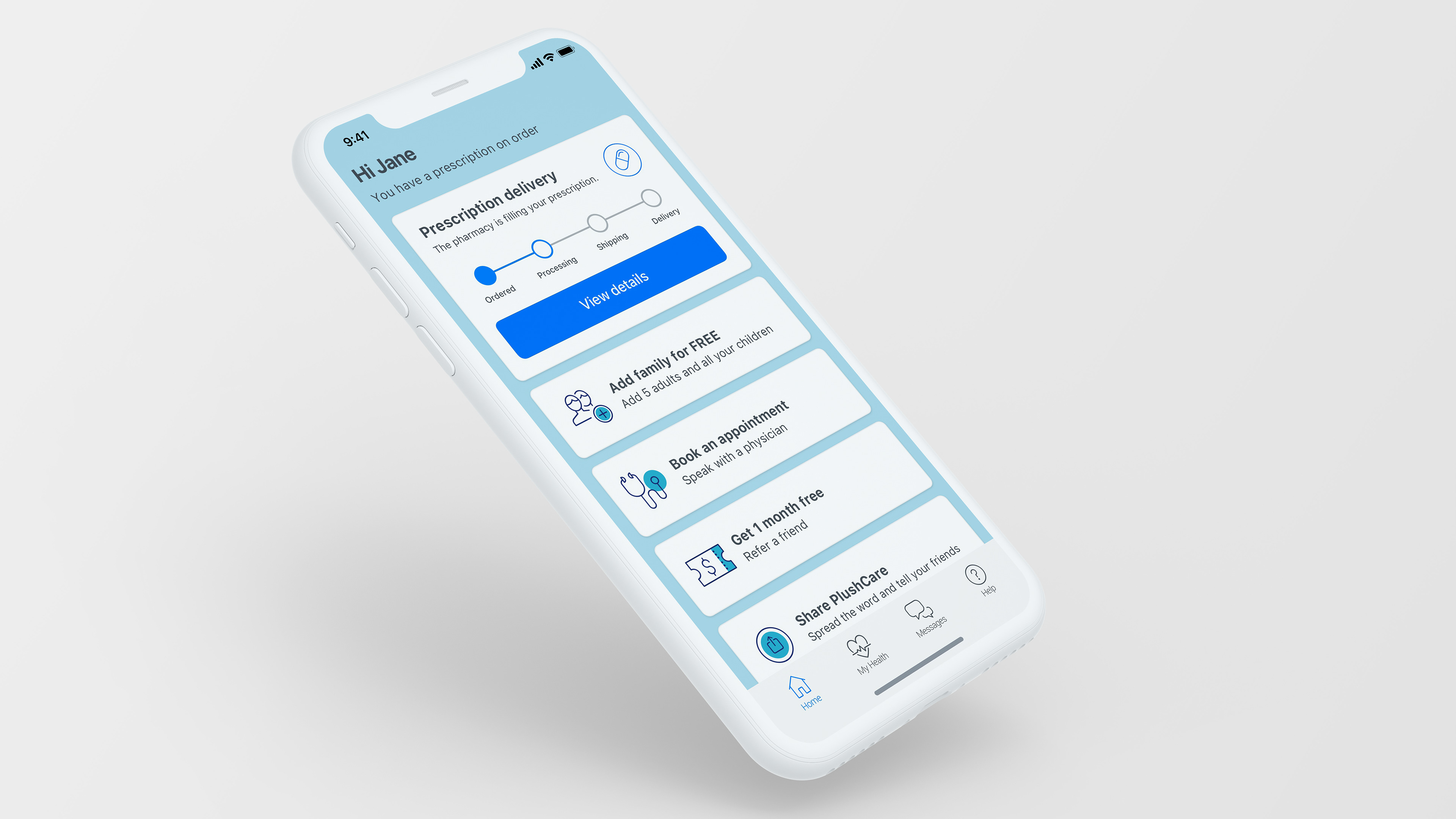
Concept for a new medication-delivery service.

While employed as the lead UX designer at PlushCare—a telemedicine provider for patients who want a same-day doctor's appointment and prescription—I provided research and design for a new product. Working with the Member Experience team, I designed the user experience for a new prescription medication–delivery program, launched in less than 6 months.
The Process
As part of a highly agile and collaborative startup environment, I loosely followed a process organized into three phases: research, design, and development. However, together with the product manager, senior leadership, and other stakeholders, we defined the project as we went, responding to information we learned along the way, gaining knowledge, and reducing risk. I participated in all stages, from defining the goals to testing the final product before launch.

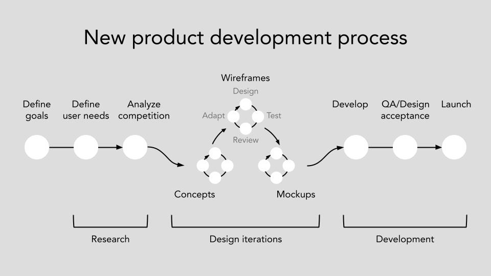
The new product development process that I loosely followed.

Goals
During the COVID pandemic of 2020, PlushCare doctors reported an increased need in mental-health care, specifically for medications to treat anxiety and depression. We defined the problem by asking: how might we provide better services for patients seeking mental-health care and medication? There were three business goals to consider.
1) Expand service into the mental-health medical specialty.
2) Launch a new service focused on prescription medications.
3) Increase 1-year membership retention 15 points, from 35 to 50 percent.
User Needs
In an annual survey, customers reported that the most valued feature of PlushCare's service was getting a prescription. Furthermore, the top reason why customers remained with PlushCare was that getting a prescription was fast and easy. 
When asked about new services, customers were very interested in discounts on medications and free pharmacy delivery to home. When asked about new specialties, customers indicated that they were the most interested in psychological or psychiatric therapies.

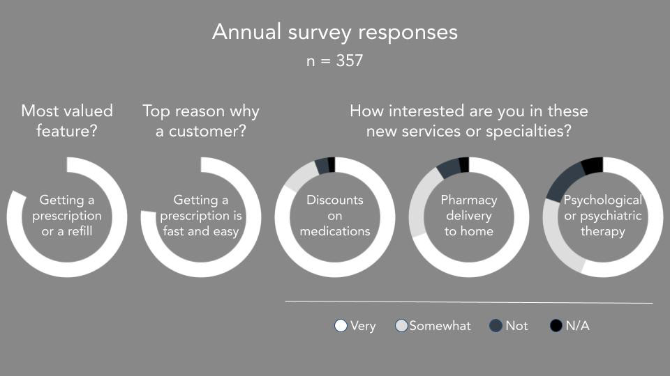
Results from an annual survey asking customers why they use PlushCare's services indicated that most customers value the convenience of getting prescriptions and many have an interest in psychological or psychiatric therapy.

We followed this initial research with a new survey sent specifically to current patients who were diagnosed by a PlushCare doctor with a mental-health condition and asked them directly about prescription services and medication delivery.
One question in particular informed our strategy moving forward. When asked if members could wait for medication to be shipped to their home, about half indicated yes or maybe. We relied on these results to cautiously but optimistically define a hypothesis that members seeking mental-health services want the convenience of having medications shipped to their homes.

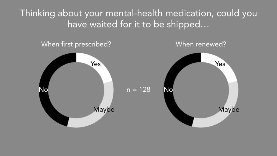
Results from a survey about mental-health services and medication delivery indicated about half of customers could possibly wait for medications to be shipped to their homes.

Analyzing the Competition
Working with the product manager, we evaluated about a dozen online services that provided mental-health therapy, prescription delivery, or both. We narrowed our focus on two telemedicine service providers: Lemonaid, which provides prescription delivery for dozens of specialties, and Cerebral, which specializes in mental-health therapy and medications only. I tested those two services from end to end.

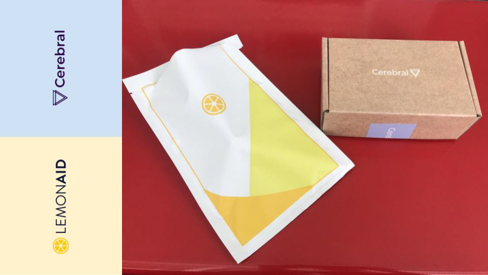
Packaging samples used by Lemonaid and Cerebral for medication delivery.

Designing Concepts 
The team wanted to challenge assumptions about seeking medical care for prescriptions. Based on our competitive analysis, we developed a secondary hypothesis that patients wanted an e-commerce approach to selecting a medication. Some competitors presented medications in this way, particularly for men seeking erectile dysfunction medication. 
To investigate this, I tested a few concepts with people closely related to our persona, Shelby (meet Shelby). I recruited an anonymous audience of 50 women who were not members to ask how they might want mental health services and/or medications. We called one of these concepts "Medication first," as an example of an e-commerce shopping experience.

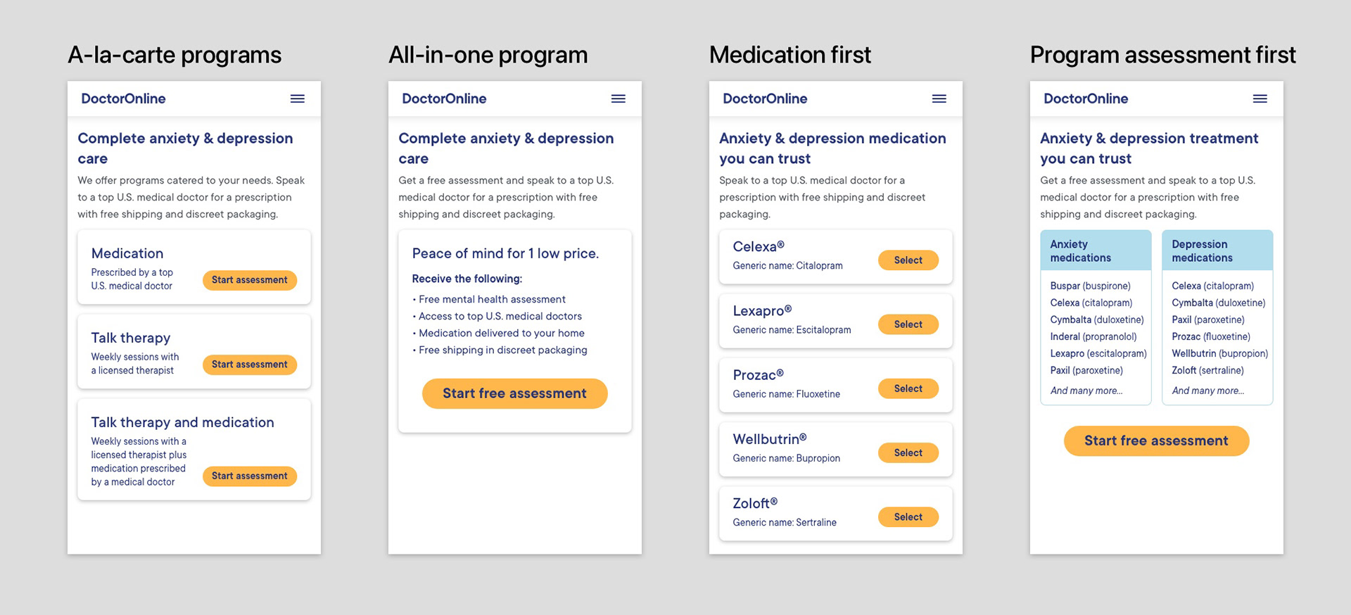
Concepts used in a preference test on Usability Hub.

Results from the concept test surprised us! We were wrong about the unique needs of women representing our persona. Unlike men seeking erectile-dysfunction medications, women seeking medication to treat anxiety and depression have different needs and the least preferred concept was "Medication first." 
The most preferred concept was what we called "a-la-care programs," indicated in the chart below. This was nearly the same as how our competitor Cerebral offered its services. It emphasized the options a patient had for therapeutic services, not the medications they could get.

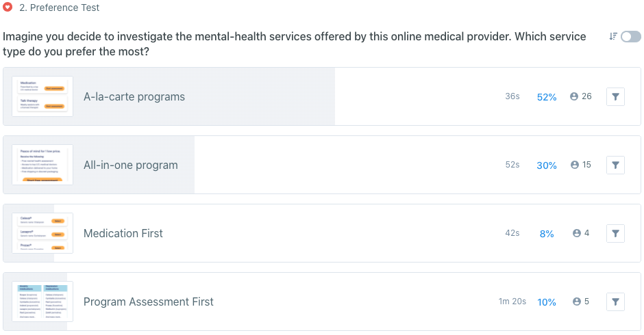
Ranking of selections from a preference test conducted on Usability Hub among 50 women, ages 25–45 years old.

Drafting Wireframes, Scenarios and Flows
After honing in on a concept and solution for our patients, I had to think through the architecture of the website, decisions users would have to make, the user journey of taking a maintenance medication, and the requirements of the user interface.
Diagramming the site architecture
When considering an e-commerce solution prior to our concept test, the inclusion of new product pages for specific medications greatly expanded the complexity of the web site. Thankfully, we avoided this complexity when we moved away from that solution. Below is an example of the site architecture.

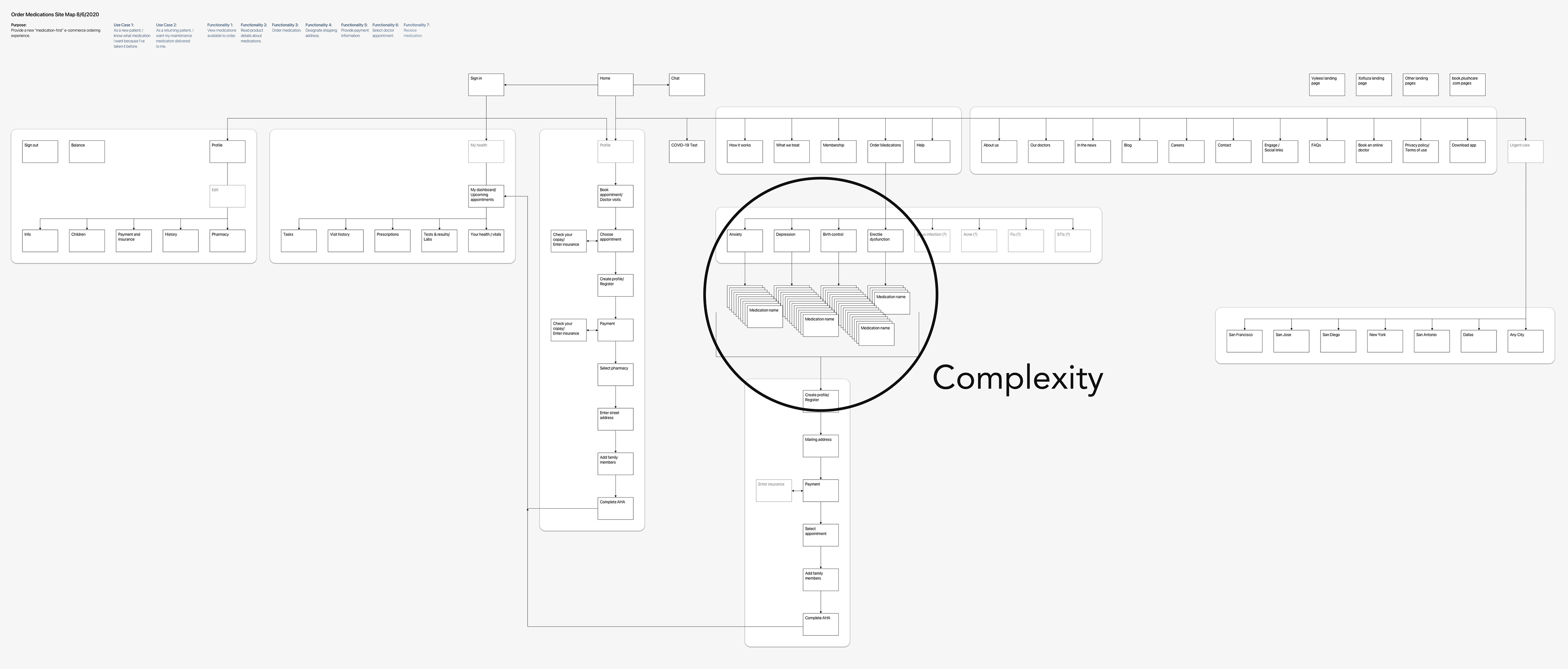
Added complexity in the site architecture, considering new product pages for medications.

Charting user flows 
I defined eight scenarios users would encounter when ordering medications for delivery, illustrated in the user flows below. The chart itself reveals the complexity of the process—in particular, complexities related to patients using insurance to pay for medications. 
If we allowed patients to input insurance details for prescription coverage, it created a complex chain reaction of decisions, uncertainty in pricing, and potential delays. Recognizing this additional complexity helped us to simplify the process and reduce the project's scope by eliminating the insurance option.

Eight scenarios illustrated in user flows.

Illustrating user journeys
In addition to the eight scenarios above, we identified six types of patients who required different levels of service in their journey of obtaining and taking a maintenance medication—a medication taken for a chronic, long-term condition on a regular, recurring basis. I identified complexity in the timing of refills and the coordination of care with doctors, represented in the journey maps below. This helped us simplify the process by structuring the service to be as all-inclusive and as flexible as possible.

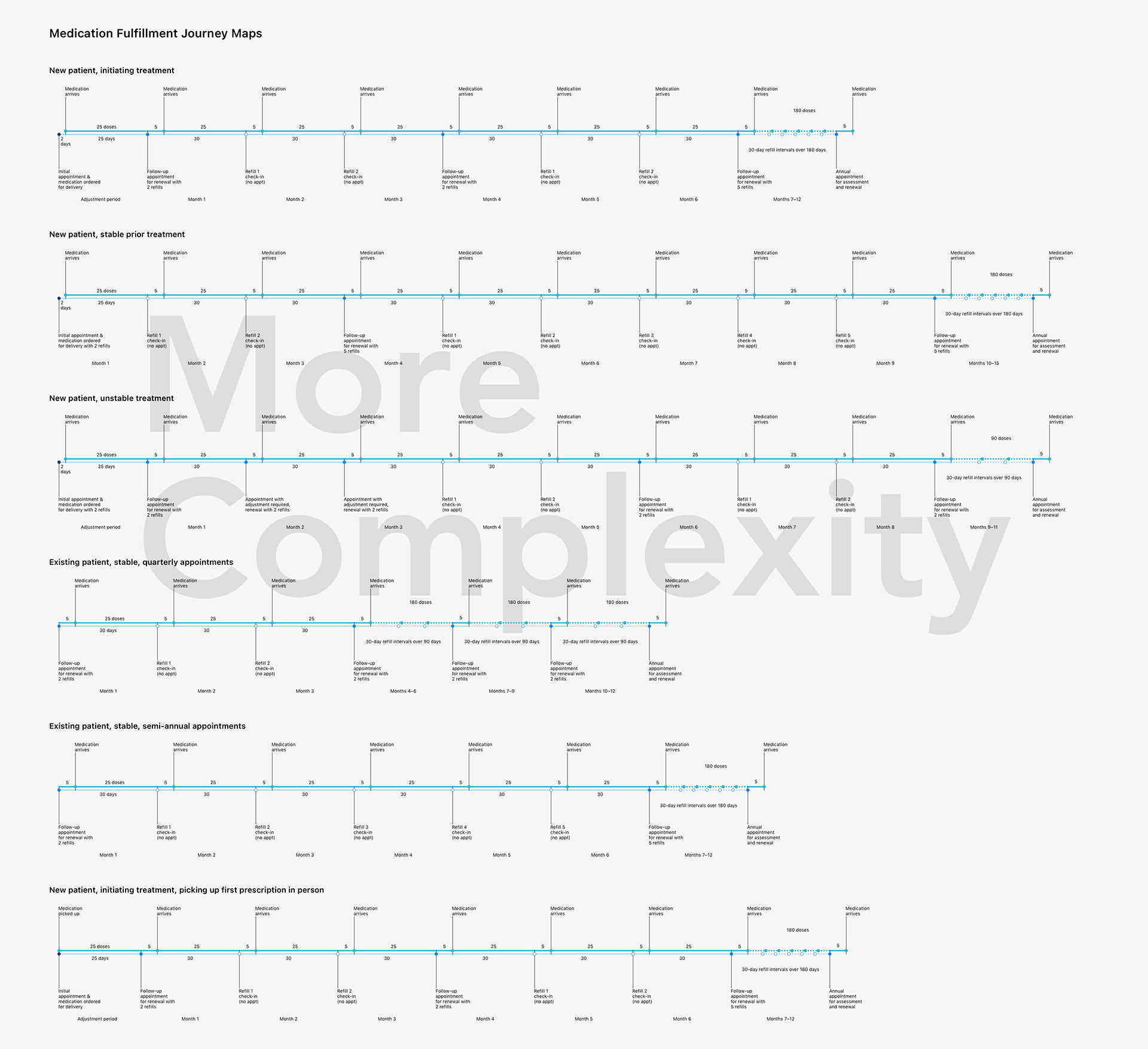
Journey maps of the process for patients to obtain prescription refills and renewals.

Encountering challenges
When designing the wireframes for the order and checkout process (represented below), two problems emerged.
1) Would prospective patients know their own needs well enough and would they understand how our service fulfilled those needs? 
2) How could patients efficiently book an appointment and checkout while providing the necessary shipping information for medication delivery?

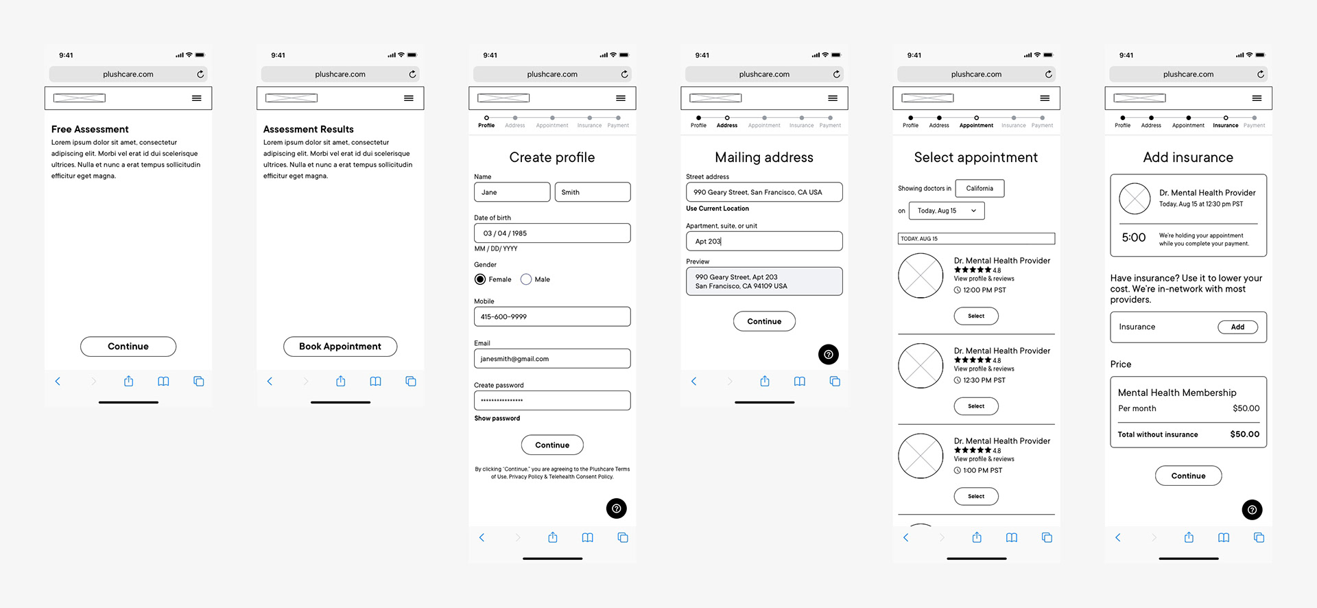
Wireframes of the preliminary enrollment and check-out process based on an existing form.

Designing Mockups
The medication delivery program required that I design three primary experiences:
1) A mobile-first web experience, for the appointment booking flow,
2) A native-app experience, for tracking medication delivery, and
3) A desktop web experience for doctors to order medications.
When designing the mockups for production, I worked with the team to solve the first problem of patients not knowing their own needs well enough nor understanding how our service fulfilled those needs. Together, we proposed three elements of the ordering process: 1) A marketing landing page explaining PlushCare's mental-health services, 2) A free mental-health assessment (including the PHQ-9 and GAD-7), and 3) A program benefits page explaining the prescription-delivery program.

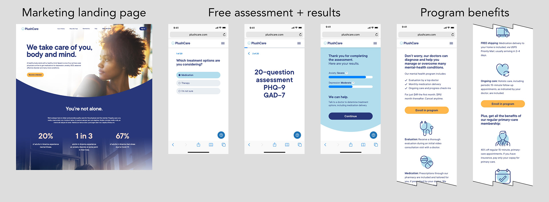
Web-based products to help new patients understand mental-health services and medication delivery.

For the checkout process, I worked with the team to solve the second problem for patients to provide the necessary shipping information for medication delivery. I broke down the existing web-based, account-creation form into a new step-by-step flow that followed the free assessment. This included improvements to the progress bar, a new back arrow, a new timer for held appointments, and a focus on one or two form fields per step, using a conversational editorial style.

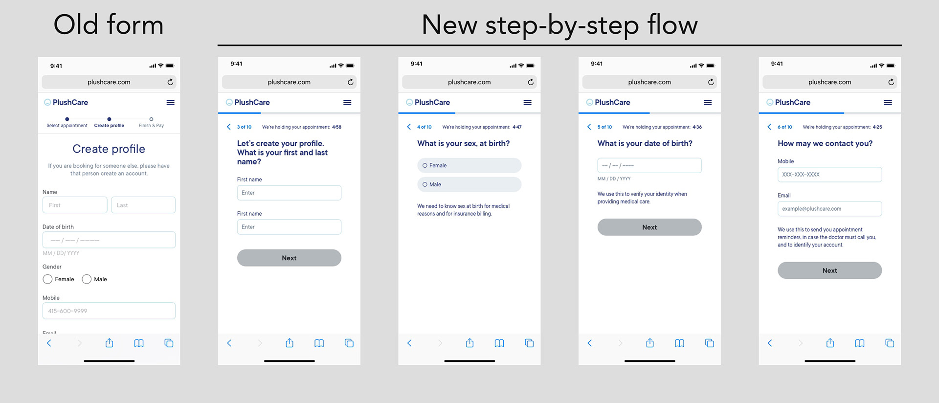
Mockups of the mobile-first web enrollment process.

Renewing or refilling?
Maintenance medication is a complicated subject. It involves a clinical concept of medication adherence. There are also significant differences between renewing a medication and refilling a medication. To complicate matters even further, we learned that many patients demanded prescription renewals without making a doctor's appointment.
While investigating the concepts of medication renewals and refills, I designed many user-facing examples, represented below. However, to avoid unnecessary complexity, we cut them out of the scope and avoided the concept of medication adherence completely. We also avoided automating refills because the company was not prepared to immediately invest in this. Together with the team, we decided program participants could obtain prescription renewals by making a routine appointment with a doctor, which was included in the program fee.

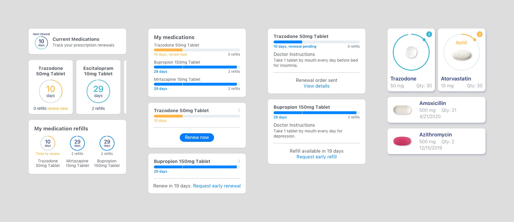
Designs considered for a prescription renewal and refill process that were cut from the scope.

Instead of pursuing an automated renewal or refill experience, we focused on the delivery experience and communicating the delivery steps to the user. There were four steps to reveal for shipments: 1) prescriptions ordered from the pharmacy, 2) medications processed (or filled), 3) order shipped (with a tracking number), and finally 4) order delivered. The mockups below depict designs for the iOS app.

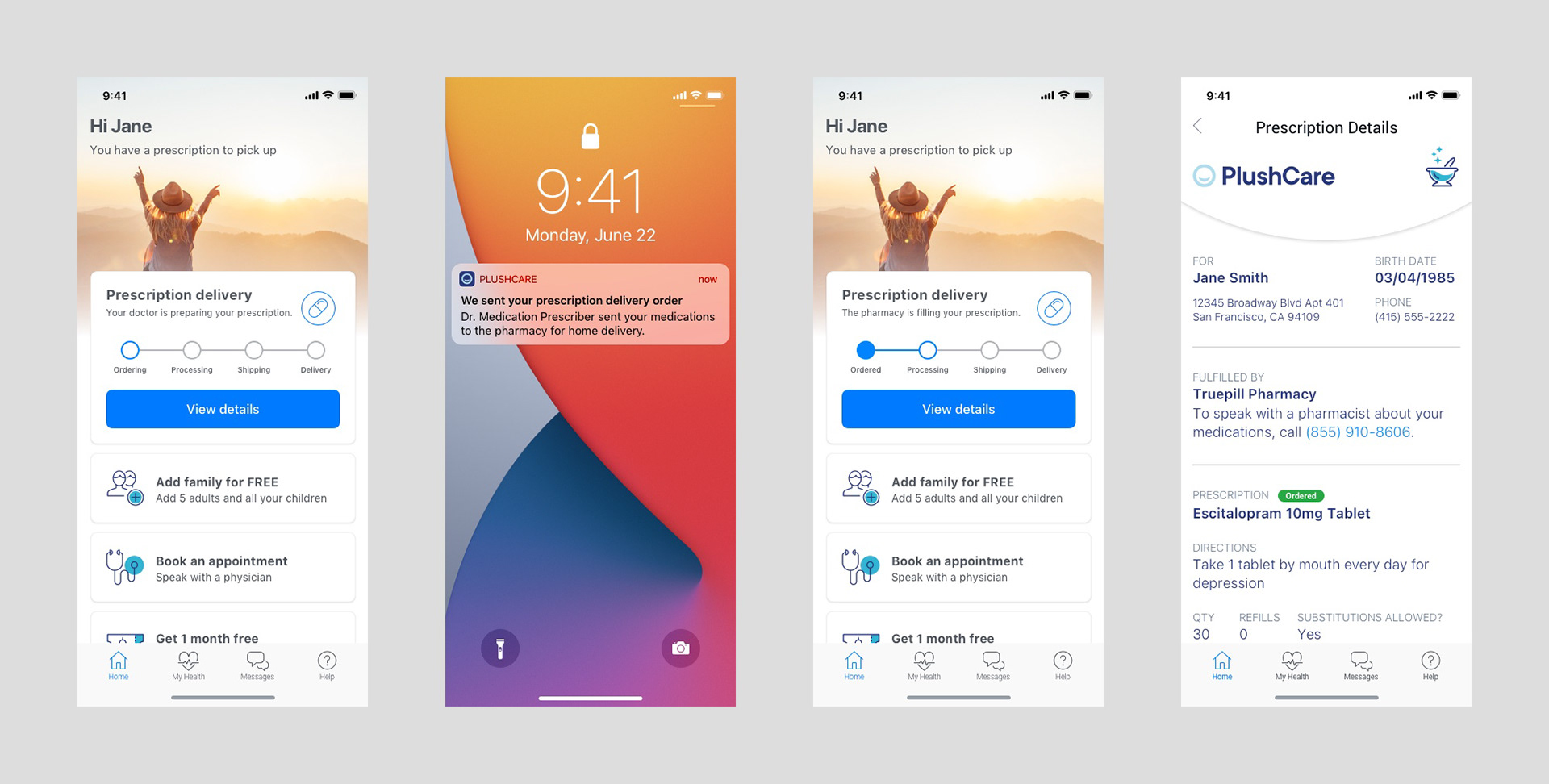
Mockups for the native-app experience

I designed an information card to appear on the home screen of the iOS native app that indicated the order delivery stage. Below, a detail of the delivery card in the iOS app shows the four steps. Additionally, I created an animation to fill the progress bar when orders moved from step to step.

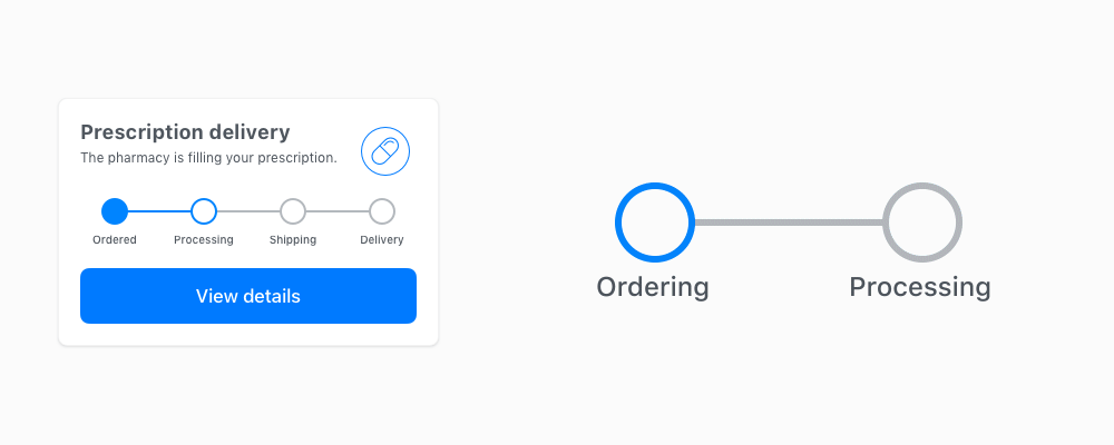
Detail of the animated progress bar.

Launch!
Within six months, we launched a fully functional, prescription-delivery program that 1) advertised the program, 2) allowed new patients to enroll, 3) enabled doctors to prescribe a medication for shipping, 4) integrated with a third-party, mail-order pharmacy to fulfill orders, and 5) updated patients on the status of their order with tracking details and notifications. This was a cause for celebration after testing the service from end-to-end and receiving medications in the mail! 
Now comes the fun part of watching patients use the program and improving it to meet their needs.
Back to Top